A DIFFERENT TYPE OF DESIGNER: JULIUS HUI 許瀚文: 建築更美的文字風景
ENGLISH: Melissa Haggerty
WITH EDITS BY ASSOCIATE PROFESSOR DAVID CABIANCA Edited by Caroline Huang
Chinese: CANDY CHAN 陳善宜
Images provided by Julius Hui and COURTESY of their creators
ypography may not be the first thing that comes to mind when you hear the word “art.” But type is everywhere: from signs on the road, to the words you scroll through on a phone, to the letters that form the sentences you are reading in this article. Classical typography is arranged to provide information. It differs from other forms of design that might shout for attention. Classical typography seeks silence: the better designed it is, the less you notice it.
設計師 DESIGN: 許瀚文 JULIUS HUI|張堅強 KIN CHEUNG | 馮景祥 SAMMY FUNG
Typeface or font designers are a rare breed. And Chinese typeface designers are even more scarce, which one can understand given this context: The average Western/Latin typeface is comprised of about 200 glyphs (the symbols that make up a writing system, including letters, numerals, punctuation, accents, etc. ) to create a functional set, whereas the average font used for Traditional Chinese in Hong Kong or Taiwan requires over 13,000 glyphs for basic usage. That number jumps up to a staggering 20,000 glyphs for when you add other Chinese dialects and regions, such as the characters in Simplified Chinese! Uniquely, Chinese characters are comprised of a number of strokes that change in accordance to the components in each character formation. The investment needed to complete a Chinese font is huge and the nature of the work is tough and solitary, making it not so attractive to young people and new investors. It can take over a year, working full time, to design and perfect one typeface. It requires the utmost commitment.
So what kind of person is attracted to an art form that bestows very little recognition, let alone fame? What kind of person would toil for months — even years — to develop an alphabet that doesn’t even bear their name?
This story is about just such a person.
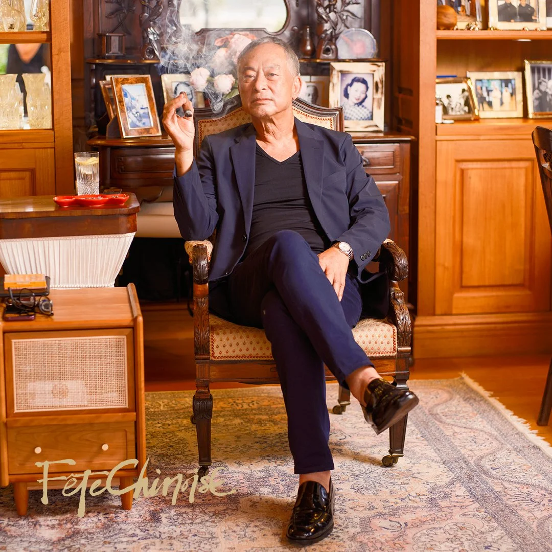
PORTRAIT of Julius Hui 許瀚文
許瀚文(Julius Hui)創造了歷史!2021年初,他發佈了「空明朝體」集資計劃不足兩個月,眾籌超過九十萬加元,遠超原定目標五倍。得到台灣和香港市場對他設計的美學認同,令他喜出望外。「自己很用心造這套字體,從沒料到兩地的支持會這麼踴躍。我剛入行時,任何和中文字體相關的事都沒太多人理會。」
設計師 DESIGN: 許瀚文 JULIUS HUI|張堅強 KIN CHEUNG | 馮景祥 SAMMY FUNG
Julius從事字體設計十多年,歷經三年跟從字體設計大師柯熾堅當學徒,先後任職英國Dalton Maag、美國Monotype等著名字體公司,亦曾為惠普(HP)、英特爾(Intel)、《紐約時報》、《彭博商業周刊》等企業設計字型,他參與開發的中文字型逾十款。Julius承認,字型設計是很困難的事情,十分考驗設計師的技藝、心智與耐性,而漢字設計的工作則更艱辛。以Julius自家設計的明體字型「空明朝體」為例,中文常用字達一萬三千多個,要是加上廣東話口語、臺語、客家語等等更加複雜。他耗時六年研究和實驗,再幾經修正,才琢磨出字型的基礎輪廓。相比起拉丁或英語系字體的二百字(字母加符號),用一年或幾個月的時間就可以盡善盡美,完全是天與地的分別。或許這也是中文字型設計師稀少的原因。在香港,仍然堅持認真的做正文字字型的不足十人。Julius笑説:「入行之前已經預料到,沒想過原來是真的很很很孤獨,哈哈...」。
Intense:Intense created by typeface designers Joe Chang from Taiwan and Hong Kong’s Julius Hui,
After graduating from Hong Kong Polytechnic University, Julius began an apprenticeship with industry giant Sammy Or and was part of the team that designed Xin Gothic. He started his own studio in 2012 and worked for a wide range of international companies, all looking for help when their businesses started booming in China. He designed the Traditional and Simplified Chinese logotypes for The New York Times and Bloomberg Businessweek as well as a custom typeface for the Chinese company Tencent. He was also a Chinese type and typography consultant for Wallpaper Magazine.
According to Julius, “There are many people who work on decorative or 'display’ type which are mainly used at large sizes or in advertising. But there are very few people who work on serious fonts that shape reading and how we perceive information.” He estimates that he is just one of ten people in Hong Kong doing similar work. And China doesn’t have many more than that; perhaps twenty individuals at the most… They work silently behind the scenes to continue adding personality and beauty to the Chinese characters that allow us to type and compose everyday.
The different coloured lines depict the transition between the
older and updated character. The minute details of the work is
time-consuming, as each stroke requires attention and adjustment.
Letterforms are not political, but the design and cultural differences between the two written scripts do affect how they are perceived. “Type designers from Mainland find the Traditional Chinese of Hong Kong and Taiwan so dark and complicated that it discourages them from reading it at all. And, conversely, designers born using Traditional Chinese find Simplified Chinese unnatural and imbalanced.” Because of this, he has been working on a new font that he hopes will build a bridge and inspire a closer connection between the two.
協調黑與白的關係
一般人看字,看到的是資訊。對字型設計師而言,看到的是黑與白的關係。「字是很神奇的東西,如果做好了,一般人大概不會發現『字型』的存在。但只要有哪些字做得不好,人很快就分別出來,兼留下負面印象。所以,這專業很重要,得要有人去參與。」以常用字型「新細明體」為例,為了加強閱讀的清晰度,小字筆畫之間的空白會留得大一點;若作路標、告示的字體,設計師就需把橫劃加粗、筆畫間空白加大,以方便人們在遠距離之外觀看。字型設計師的專業,就在「協調黑與白的關係」。「造字這門學問學無止境,在於字的直線曲線無窮變化組合中,要不斷摸索美感。捉緊了美感後,如何把感覺呈現,就是工藝,背後還有很多設計思維。」Julius認為:「字,要給人舒適的感覺。」
Sample of a technical working file showing Japanese and Chinese characters of Ku Mincho and Heldane fonts.
Six years in the making, Julius’ typeface Ku Mincho aims to capture the incomparable beauty of Traditional Chinese and the narrative embedded within each glyph. “Each Chinese character represents a history that has been handed down from ancient times to the present, passing through the hands of master calligraphers and dynastic scholars.” The character for “Ku” means “air” and this serves as both a mantra and guiding typographic principle. He wishes to make the reading experience feel as natural and effortless as breathing. “Given mainland China’s influence and the dominance of Simplified Chinese, we want to create a more welcoming context for our mother language and hope that this might inspire more people to appreciate Traditional Chinese.”
The process has not been without its hurdles. Everyone told him there was no market for Ming typefaces because they are regarded as old fashioned. Adding to that challenge, at the beginning he wasn’t sure how to achieve his goal, even though he could visualize what he wanted the design to look like. He let the idea percolate and even moved to Berlin for a while, before COVID-19 showed him the way home. Interestingly, it was his return to Hong Kong that finally made the time feel “right” to tackle the monumental project. He reunited with old colleagues and, working closely together, they overhauled the design and came up with an ambitious timeline: 7,600 characters will be available by March 2022 and the full set of 15,000 is scheduled for completion in July 2022. Ku Mincho differentiates itself from existing Ming typefaces by breaking free of the square box frame that has been imposed by the Japanese foundries that have dominated the font business for decades. Ku Mincho is also the first Chinese typeface that has been optimized for both horizontal and vertical reading directions and includes minute differences in strokes and proportions.
美學要求和現實平衡
越來越多機構需要開拓華語市場,對設計獨特的中文字體款式渴求更大。字體的圓潤、前衛、寬或窄等,都是表現品牌理念不可或缺的一環。繁簡體字的運用,對設計固然亦有顯著影響。Julius說一般的繁體字看起來比簡體字更穩固的原因,是繁體中文全是約定俗成而來。橫竪鈎點撇捺,剛勁輕柔皆可,每個中文字都是自古流傳下來的文化:「多年來透過多位美學高深的大書法家、歷朝士大夫的千錘百煉而傳承下來。有棟有樑、有屋簷、也有點睛的裝飾,結體和筆劃等都是大自然已有的視覺規律,一切都來得自然又合理。」他比喻四四方方的漢字架構像建房子:「舉例說,magazine這個字就是長成magazine的樣子,如果寫成mgzne,原字的樣貌也看不出來,這算是簡化嗎?一間房子就是有樑有柱才穩固,偷走樑柱、字變不穩,算是簡化嗎?」
Sponsored by HKETO.
談到簡體字字型,Julius說:「簡體字太空洞,如果從簡體出發做字,大概很難再設計出有傳統中文美感的字型。然而他們卻是最大的字型生產者,如果群眾眼睛習慣了這一套,日後就很難再傳承中文美學的設計。」談到美學要求和現實需要的平衡,他認爲現今的挑戰是,常用字型沒有美學根基:「簡單來說,越來越多看起來差不多的字型在市場販售。從美學看,他們多是無色無味,但一般人認為,中性字型才不會搶去文章內容的焦點。不過,如果看起來不美,也不會買,道理簡單卻一直造成市場問題。」
他認爲正體字之爭過於政治化,這是比較複雜的問題:「因為我母語是繁體中文的關係吧!反之我中國國內的朋友是讀簡體中文長大,他們倒覺得繁體中文才是問題。」説到底,Julius始終堅持提供新的意見和選擇給市場。
We asked Julius if, in general, this was lonely work, to which he replied, “It is! But I was prepared for that before I even went into the industry.” He pauses longer before answering our next question about why young people aren’t lining up to join the industry. “Font design in the West is still a smart business because you are only dealing with 200 or so characters. In this part of the world, though, it is a dying art; and maybe not a particularly wise career. You practice for so long and invest so much time without knowing if there’s even a need for your product, let alone a profitable return after all the effort. The dedication and discipline it requires does not seem to attract the younger generation who are used to instant-gratification today.”
Julius seems undeterred by this. He keeps his head down and forges ahead with his craft, determined to bring beauty and structure to the words we use and absorb every day. “My travels around the world have made me understand the importance of design in my local community. By serving society and developing a better visual culture through type design which will impact text from books to signage to writing on the computer, we will improve daily life for everyone. I hope that little by little, our community will start to appreciate that there are people working behind the scenes on all these details to make the cultural landscape we see more compelling and aesthetically beautiful.“
識字、析字、惜字
匆匆忙忙的過日子,大家可有空閒欣賞中文字?特別在香港,藝術創意不獲重視,文化和工藝行業逐漸式微,那字體排印的路還可以走多遠?Julius說:「字體設計需投資心機與時間,但是回報難看見,『空明朝體』是非常幸運的例子。」
作為漢字設計師,Julius希望藉着自己構思的「空明朝體」,帶出與別不同、空氣流動、如同呼吸般舒適的閱讀感覺。相對較常見的明體,一板一眼、工業感較重,「空明朝體」在設計中加入許多技術細節,提升質感的同時,舒適、清晰、易讀。一般人就算是以一般的文書軟體 Word、PowerPoint 編排,也能輕易做出生動、舒適的版面,很容易能廣泛運用在日常生活中。
在世界走了一圈,Julius明白設計工作在本土的重要性。他的目標是服務在地的社群、透過做字推動本地視覺文化的發展、改善在地每天生活的樣貌:「我希望影響到本地人做更多美事,讓更多人到來這裡的時候,可以看到在地社區最好樣貌,然後再傳播開去。而我也把自己的工作大多轉向網上,盡量減少危害地球的生活痕跡。」
「空明朝體」只是一個開始,Julius希望可以啟發更多設計師,創作更多注重美感、舒適的新中文字體。「我想,做好今天的自己,做好當下的新趨勢,就可以好好發揚開去。」 許瀚文的夢想是讓中文字型變得很好用、更精彩!
sponsored by HKETo.


From April 11 to 13, the Grand Quay in Montreal’s Old Port will host the highly anticipated 2025 edition of Plural, Canada’s leading contemporary art fair. Formerly known as Papier, the fair began with a focus on works on paper and has since evolved into a reimagined event that reflects the multiplicity of voices, practices, and mediums shaping contemporary Canadian art. Amongst the standout projects is Like raindrops rolling down new paint, Karen Tam’s evocative work, presented by The National Bank and staged in the Espace Banque Nationale.